NOT a Gelato
Ice Cream - Brand & Identity Creation
Brand Design - Logotype / Color & Typography / Mood & Identity
NOT a Gelato is a conceptual ice cream brand that challenges the conventional idea of what a product should be. It’s not just about selling ice cream, it's selling a vibe, a mascot that connects with clients, it’s about questioning how we consume, design, and experience something as ordinary as dessert.
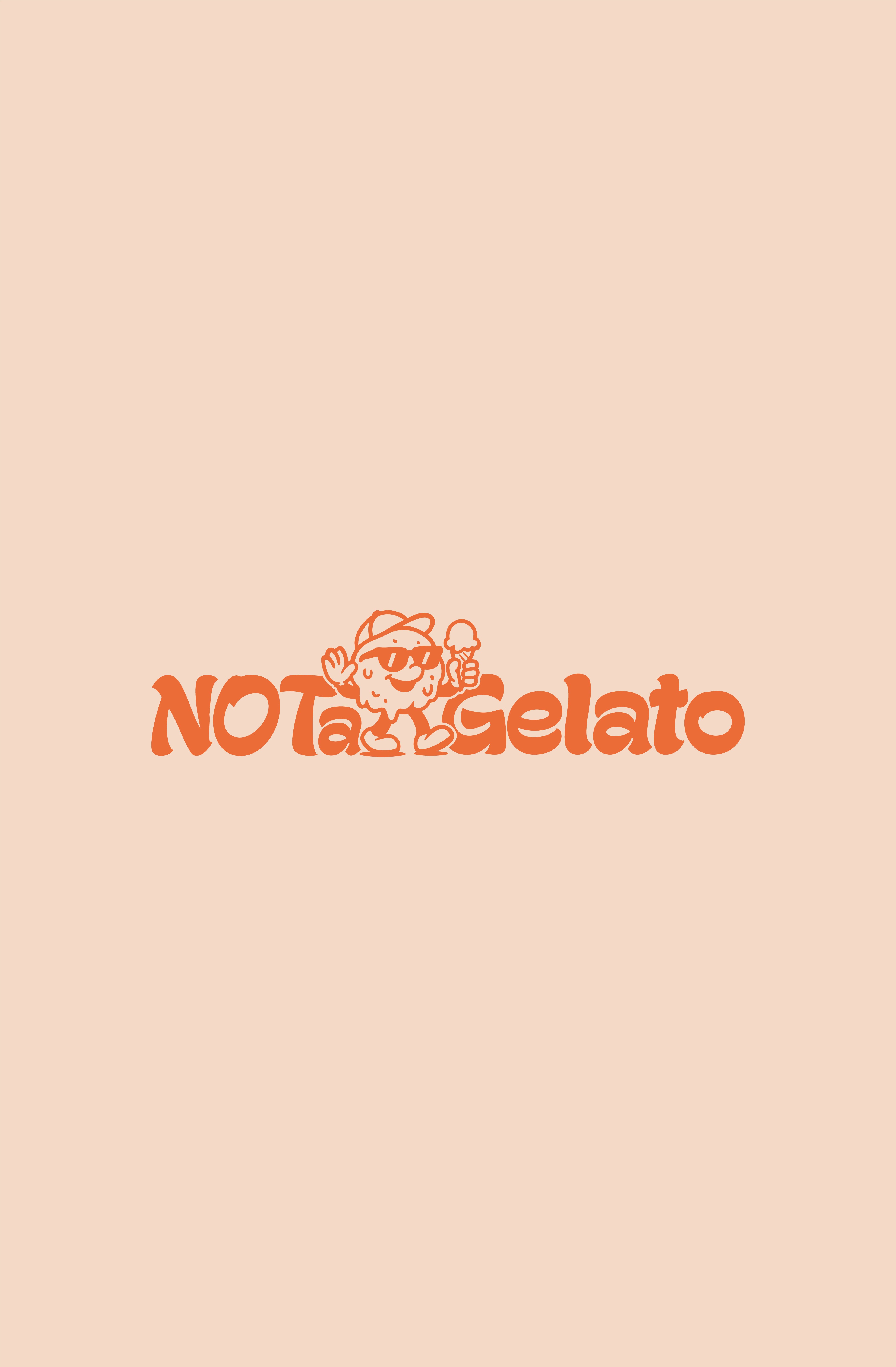



Brand & Mascot
Brand & Mascot
From naming to branding, tone of voice, and visual identity, the project turns a simple treat into an aesthetic and cultural statement.
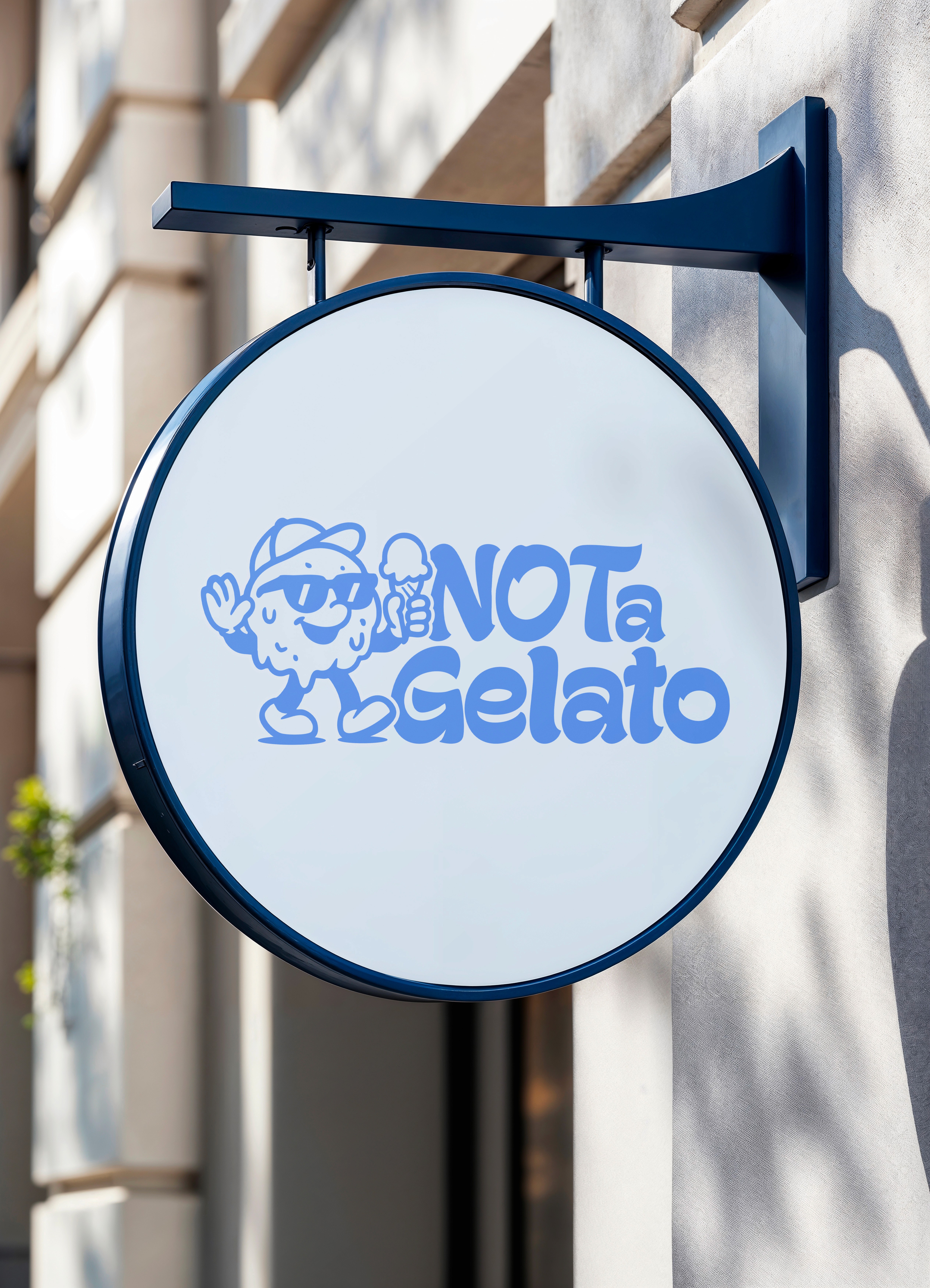
NOT a Gelato transforms its brand persona into a logotype-mascot that embodies its identity, a cool and playful melting ice cream ball that’s (arguably) eating itself.
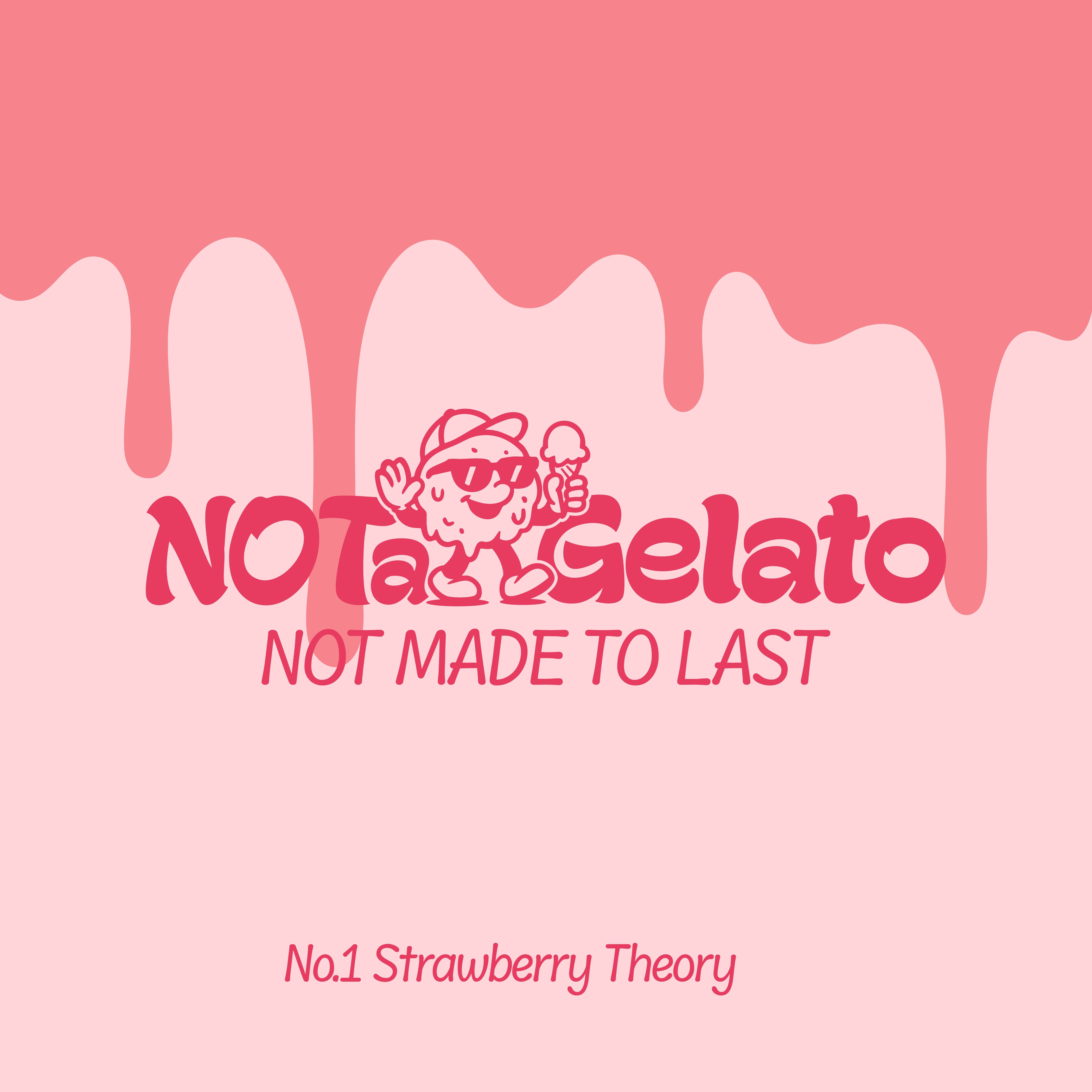


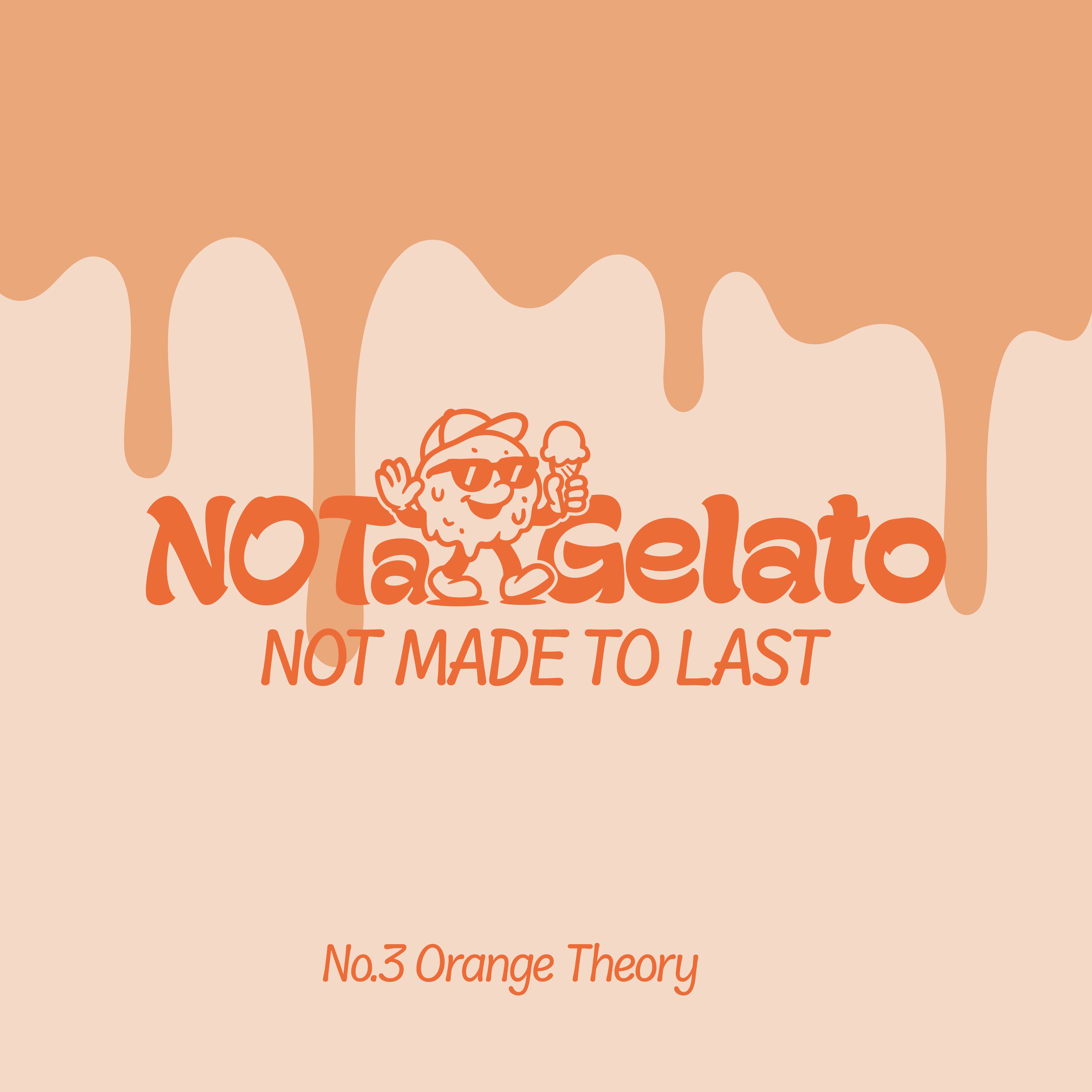

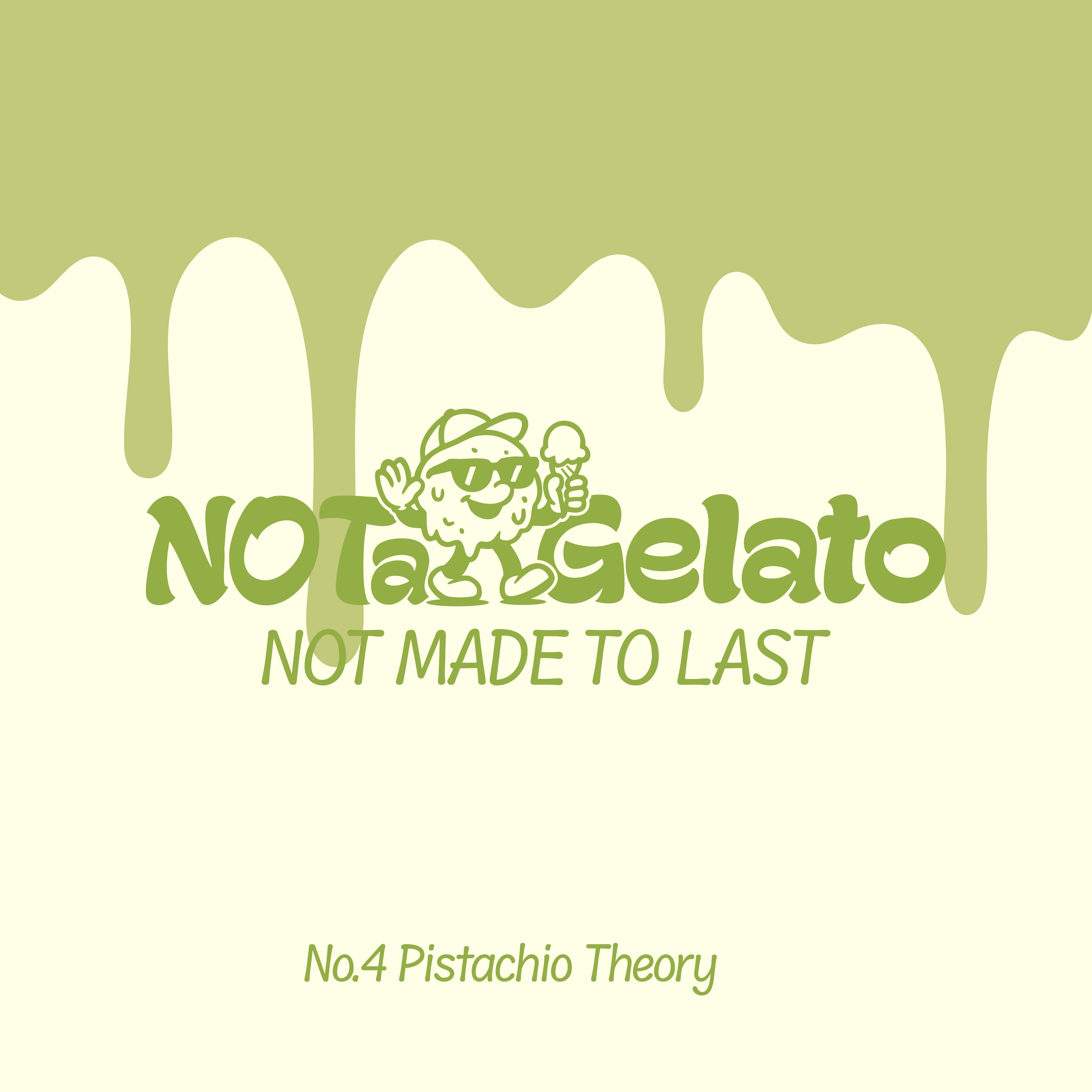

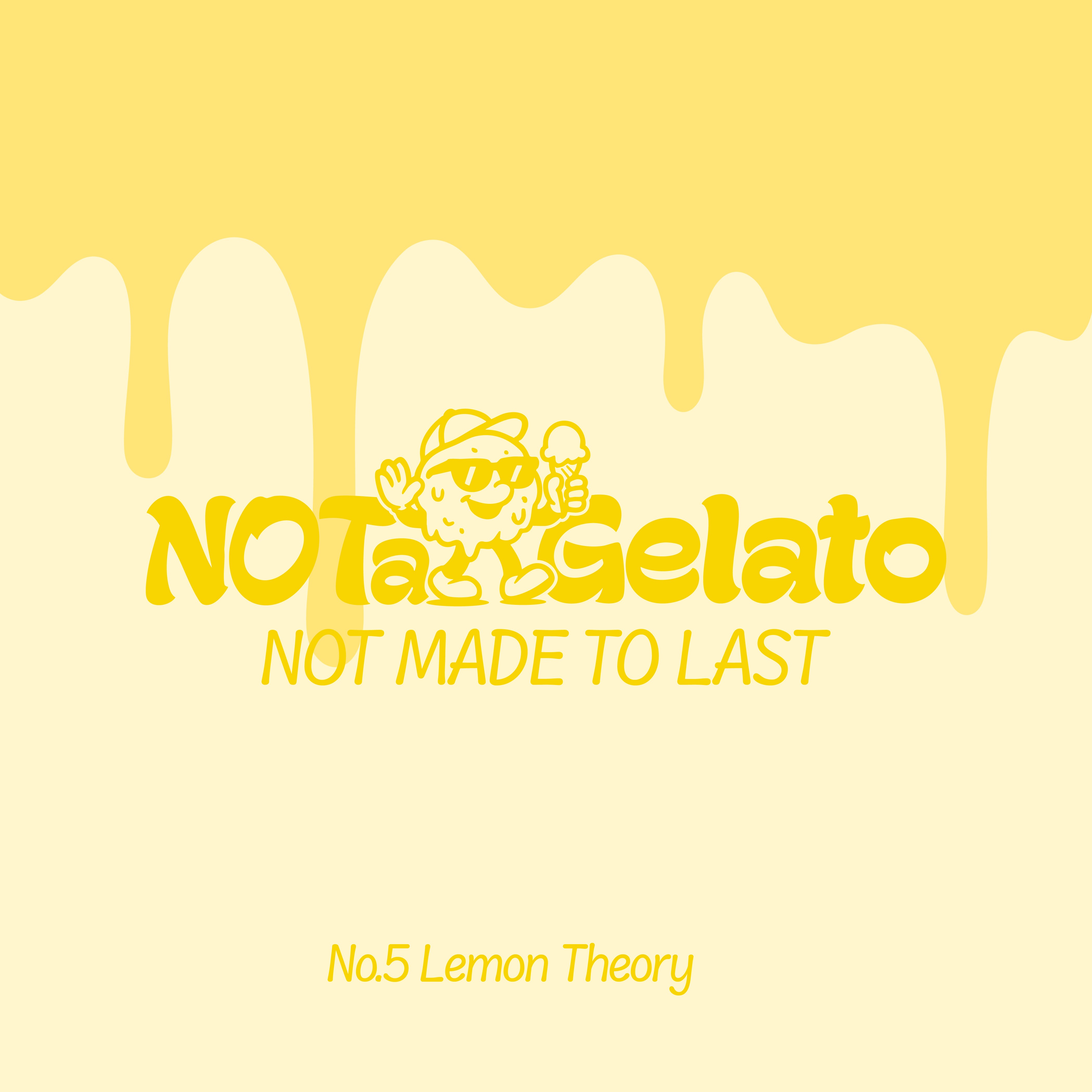

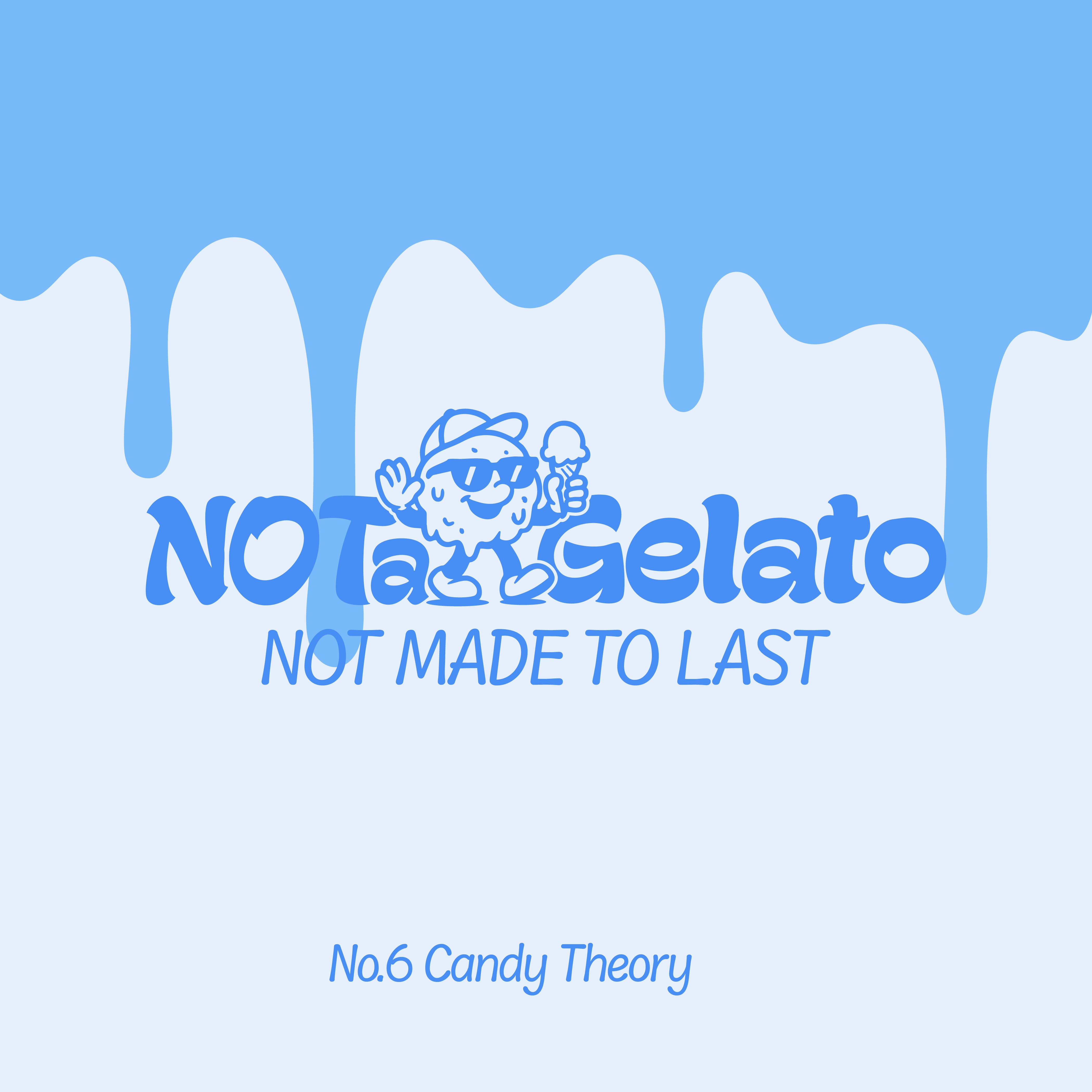

Color & Flavour Identity
Color & Flavour Identity
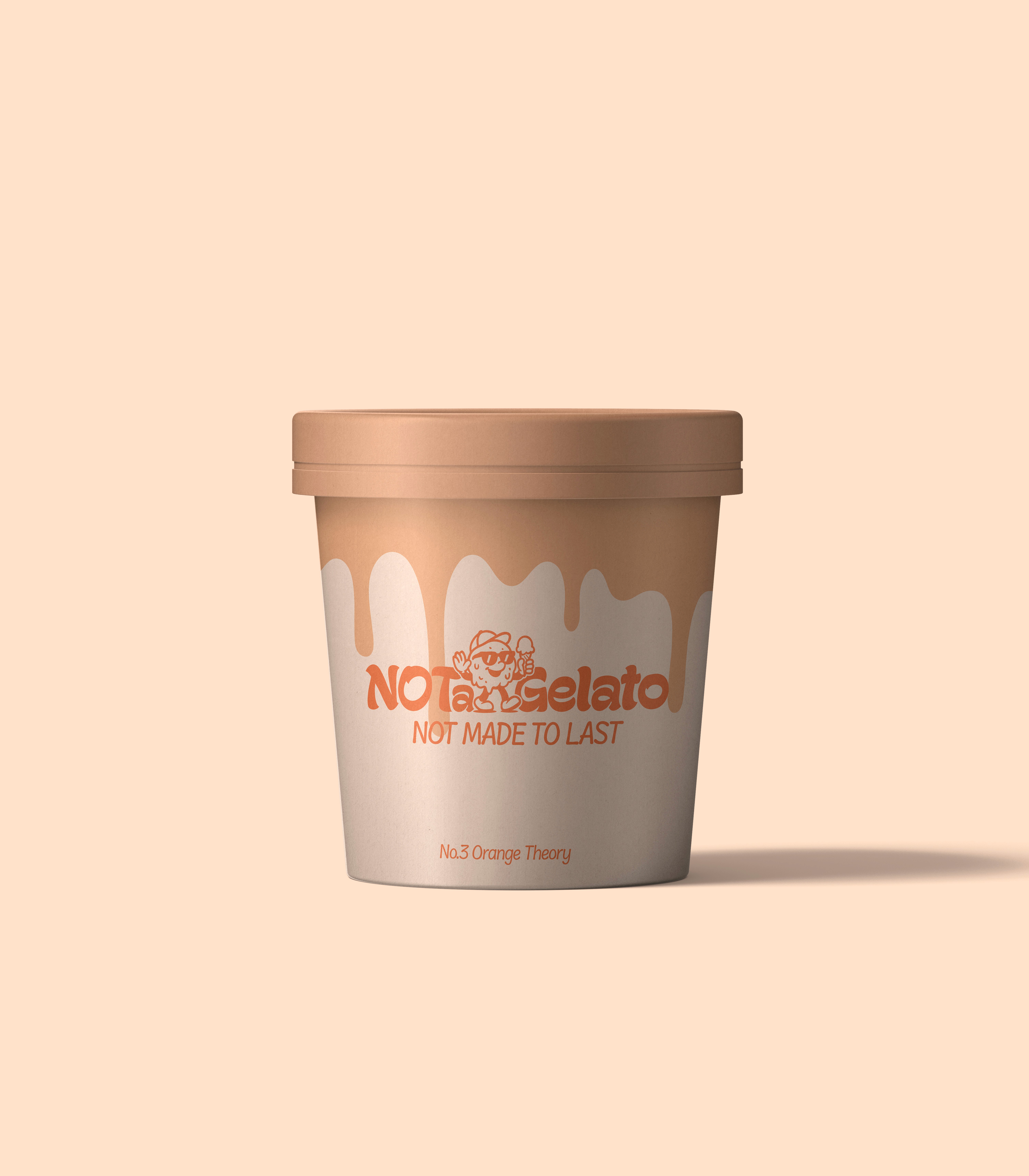
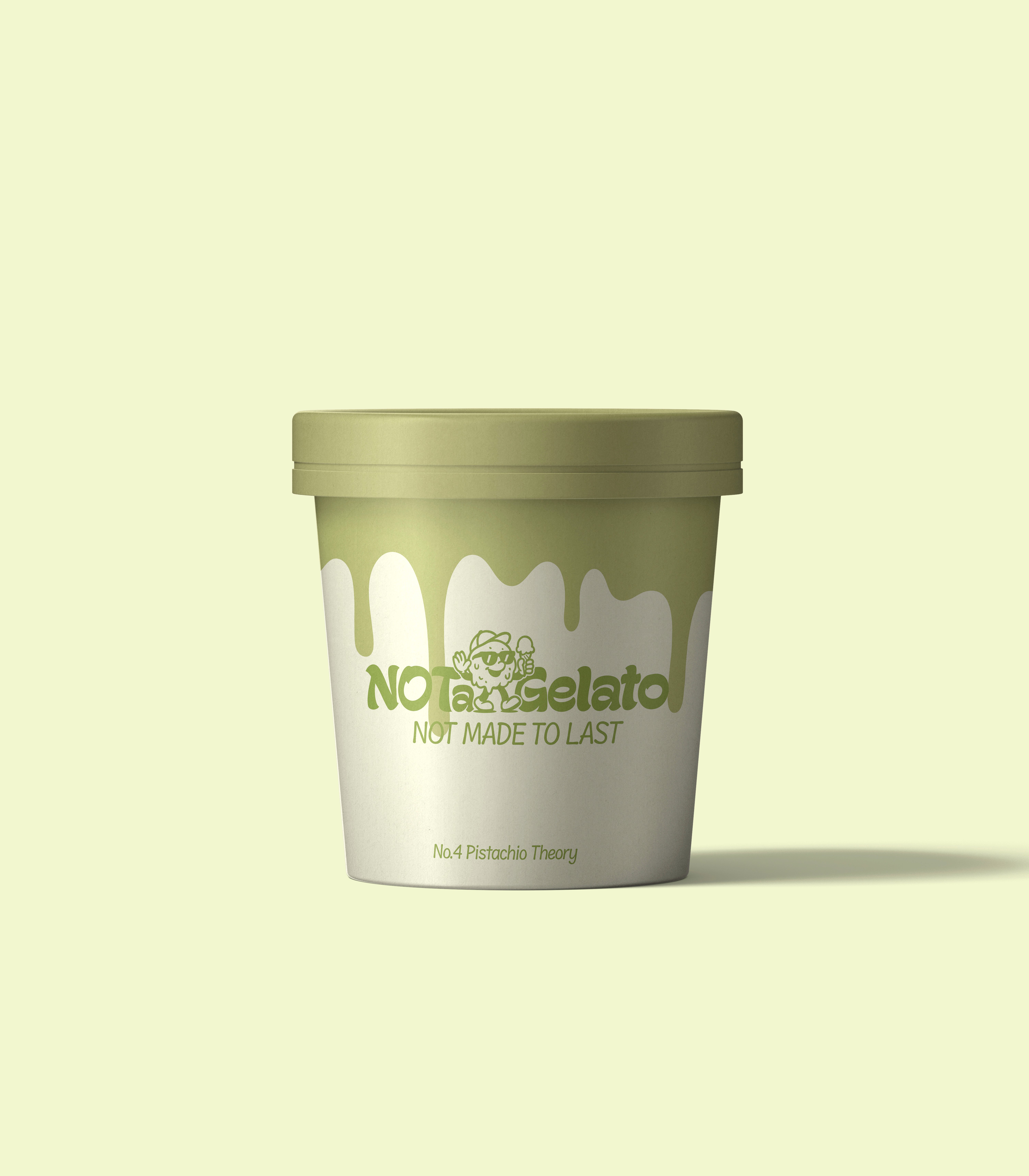
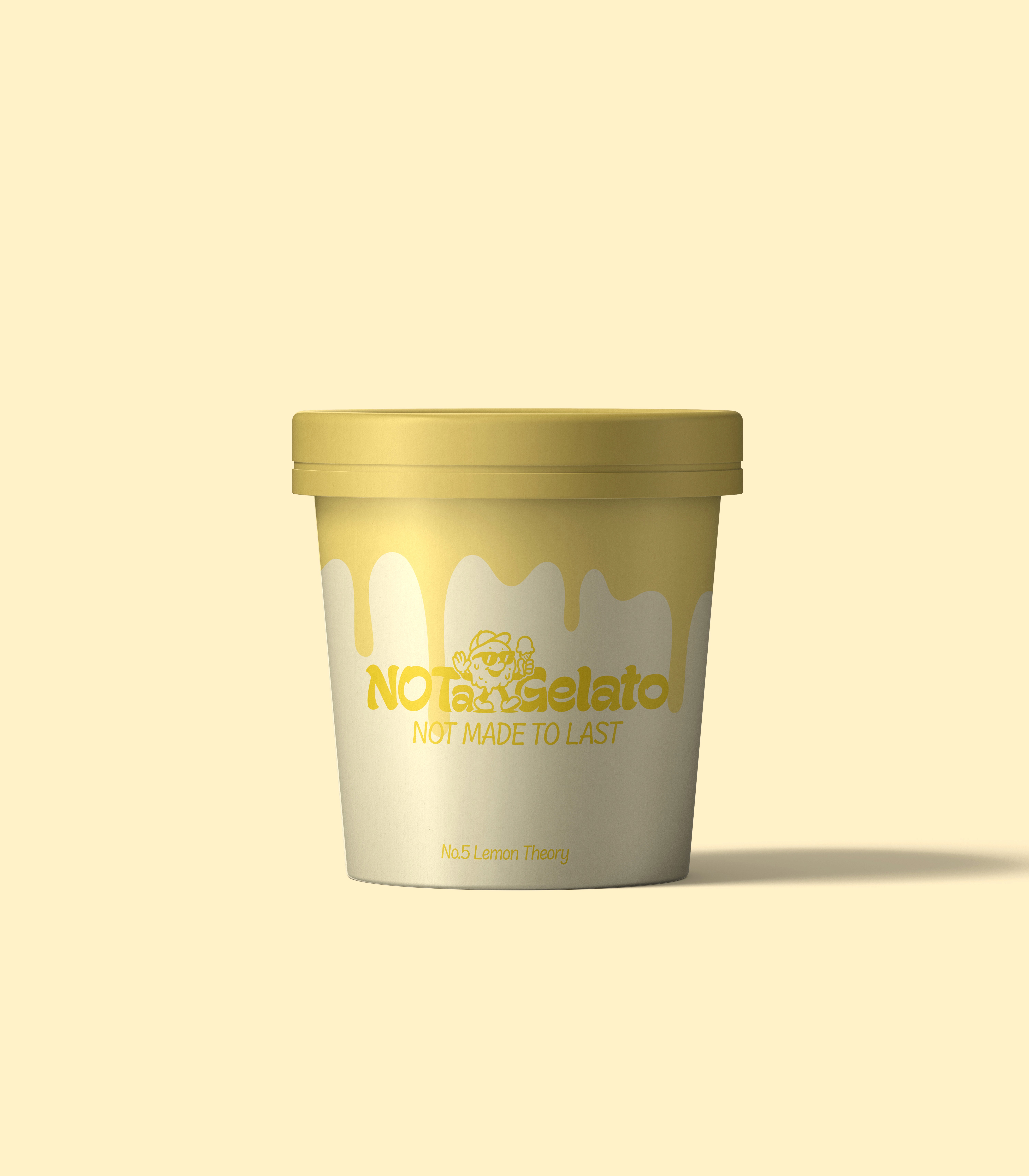
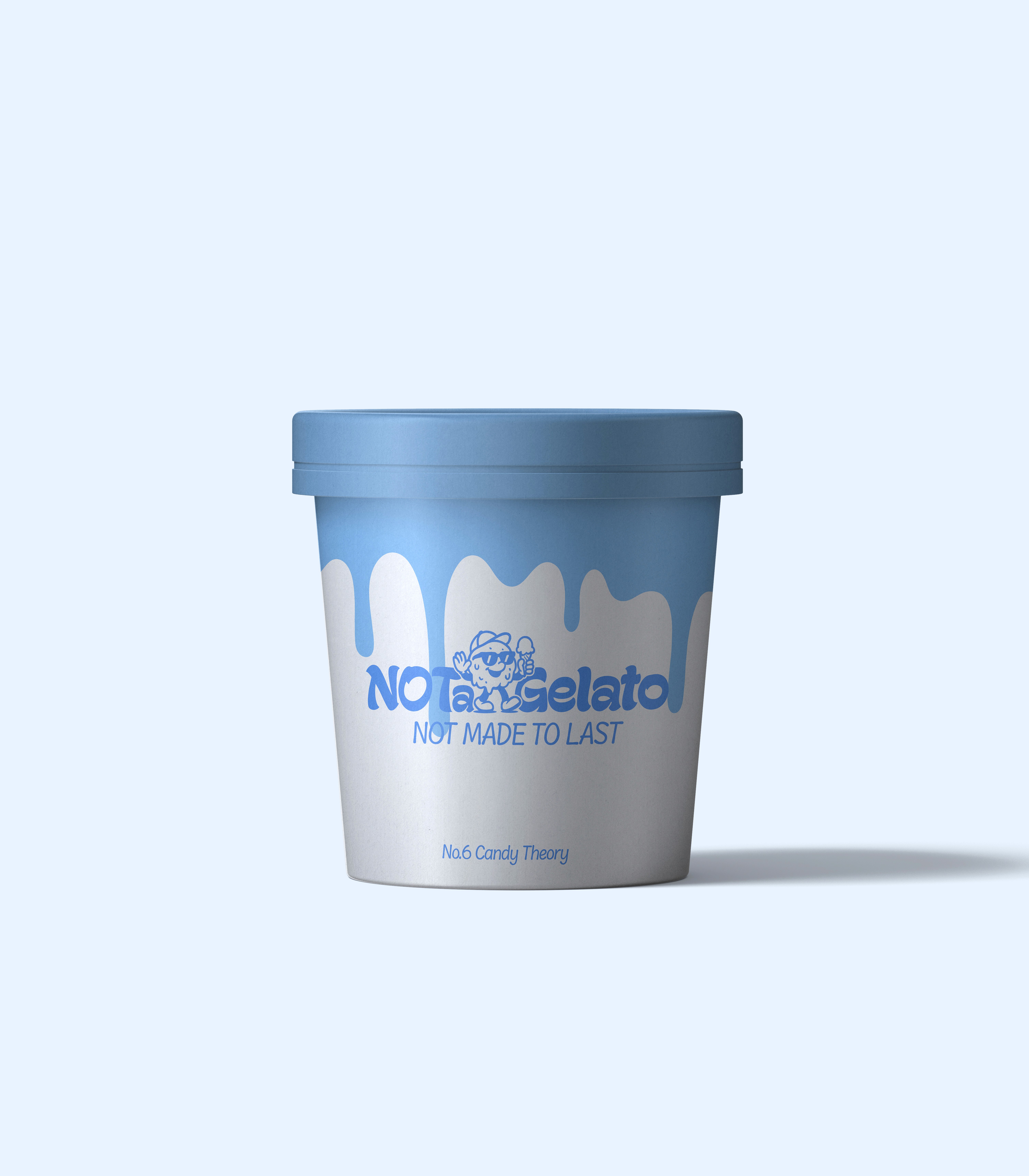
Each flavor has an ironic name and its own narrative. The branding plays with contradiction, humor, and editorial cues, transforming every cup, sign, and menu into a designed object.
NOT a Gelato isn’t here to please, it’s here to provoke and connect. Not for everyone, but for those who know how to taste irony.
From Brand Story to Brand Packaging
From Brand Story to Brand Packaging
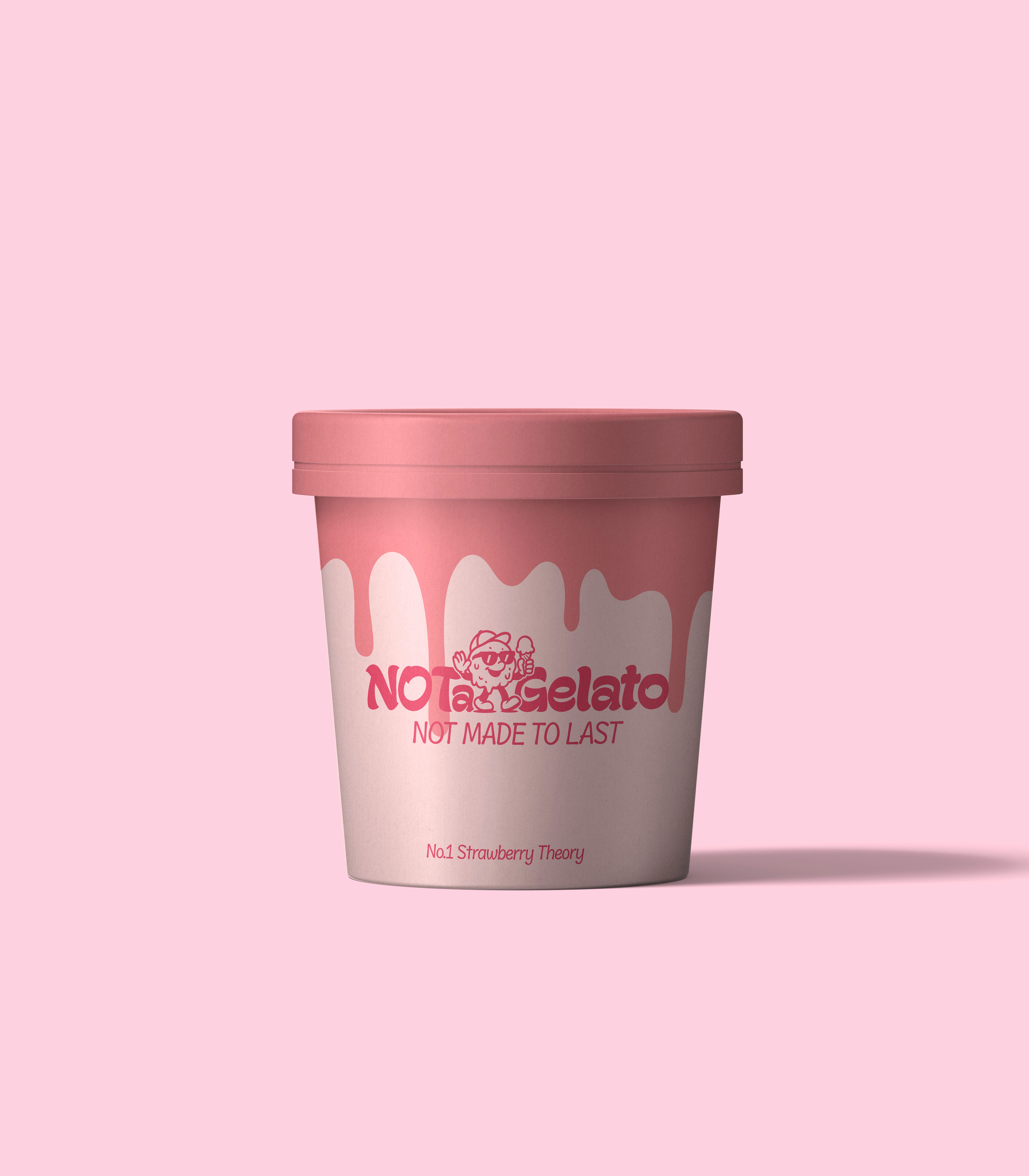
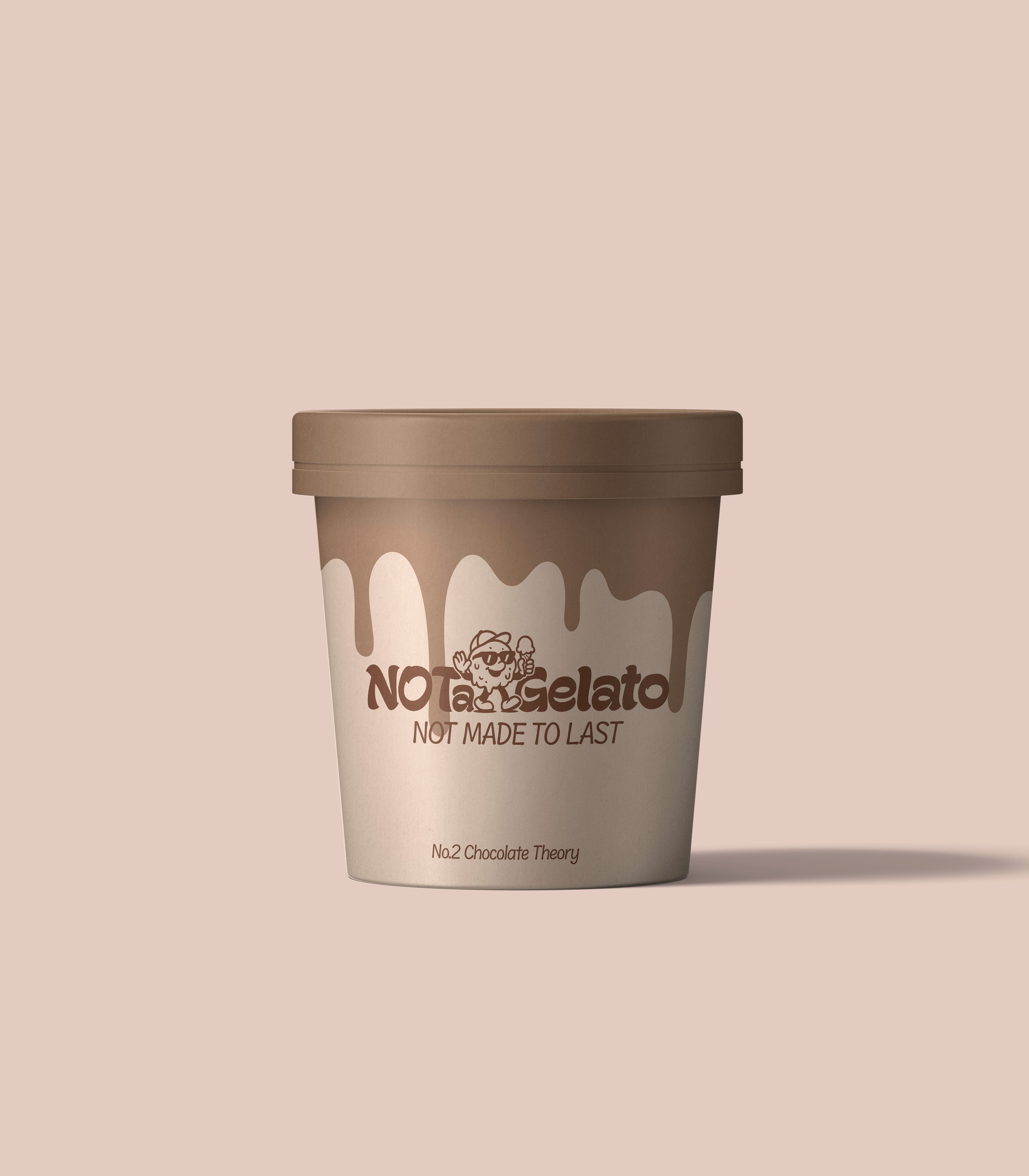
It's not just an ice cream packaging, it's the visual expression of the brand's tone of voice and brand persona, turned into a take away ice cream cup.
It's not just an ice cream packaging, it's the visual expression of the brand's tone of voice and brand persona, turned into a take away ice cream cup.
It's not just an ice cream packaging, it's the visual expression of the brand's tone of voice and brand persona, turned into a take away ice cream cup.














Distinctive yet recognizable
Distinctive yet recognizable
Understanding the brand’s niche and foundational codes is key. While NOT a Gelato brings a playful and unconventional twist to the ice cream world, it does so without losing its recognizability.
The identity is bold and ironic, but still grounded in visual cues that instantly evoke “gelato”, from the soft, sweet-toned color palette to the friendly, rounded typeface. The aim was never to break away entirely, but to stand out just enough. This balance allows the brand to be different while still being perceived, instinctively and quickly, as an ice cream brand.
Be the exception, NOT the rule.
Be the exception, NOT the rule.
NOT a logo, a brand,
NOT a brand, a story,
NOT a story, YOUR STORY.
NOT a logo, a brand,
NOT a brand, a story,
NOT a story, YOUR STORY.
@notastudio.cc
@notastudio.cc