Olga Prieto
Olga Prieto
Jewelry Brand - Rebranding
Jewelry Brand - Rebranding
Brand Redesign - Logotype / Color & Typography / Brand Guidelines
Brand Redesign - Logotype / Color & Typography / Brand Guidelines
To celebrate its 20th anniversary, Olga Prieto redesigns its entire brand image to elevate, modernize and simplify. But above all, to create a timeless elegance that comes through in both its jewelry pieces and the new brand image. The result is a fashion editorial look that helps position the brand with a more luxurious and elegant feel.
To celebrate its 20th anniversary, Olga Prieto redesigns its entire brand image to elevate, modernize and simplify. But above all, to create a timeless elegance that comes through in both its jewelry pieces and the new brand image. The result is a fashion editorial look that helps position the brand with a more luxurious and elegant feel.

Vision
Vision
Vision
We focused on clarity, simplicity, and strength. By decomposing the brand to its core values, we shaped an identity that elevates perception without losing its artisanal soul. The result is an identity that feels established, modern, and deeply personal.
We focused on clarity, simplicity, and strength. By decomposing the brand to its core values, we shaped an identity that elevates perception without losing its artisanal soul. The result is an identity that feels established, modern, and deeply personal.
We focused on clarity, simplicity, and strength. By decomposing the brand to its core values, we shaped an identity that elevates perception without losing its artisanal soul. The result is an identity that feels established, modern, and deeply personal.
Strategy
Strategy
Strategy
Olga Prieto’s rebranding marks a return to essence. The new identity embraces timeless elegance, capturing the confidence of a brand with history. Rather than reinvent, we refined, creating a visual language that feels editorial, enduring, and quietly luxurious.
Olga Prieto’s rebranding marks a return to essence. The new identity embraces timeless elegance, capturing the confidence of a brand with history. Rather than reinvent, we refined, creating a visual language that feels editorial, enduring, and quietly luxurious.
Olga Prieto’s rebranding marks a return to essence. The new identity embraces timeless elegance, capturing the confidence of a brand with history. Rather than reinvent, we refined, creating a visual language that feels editorial, enduring, and quietly luxurious.
Design
Design
Design
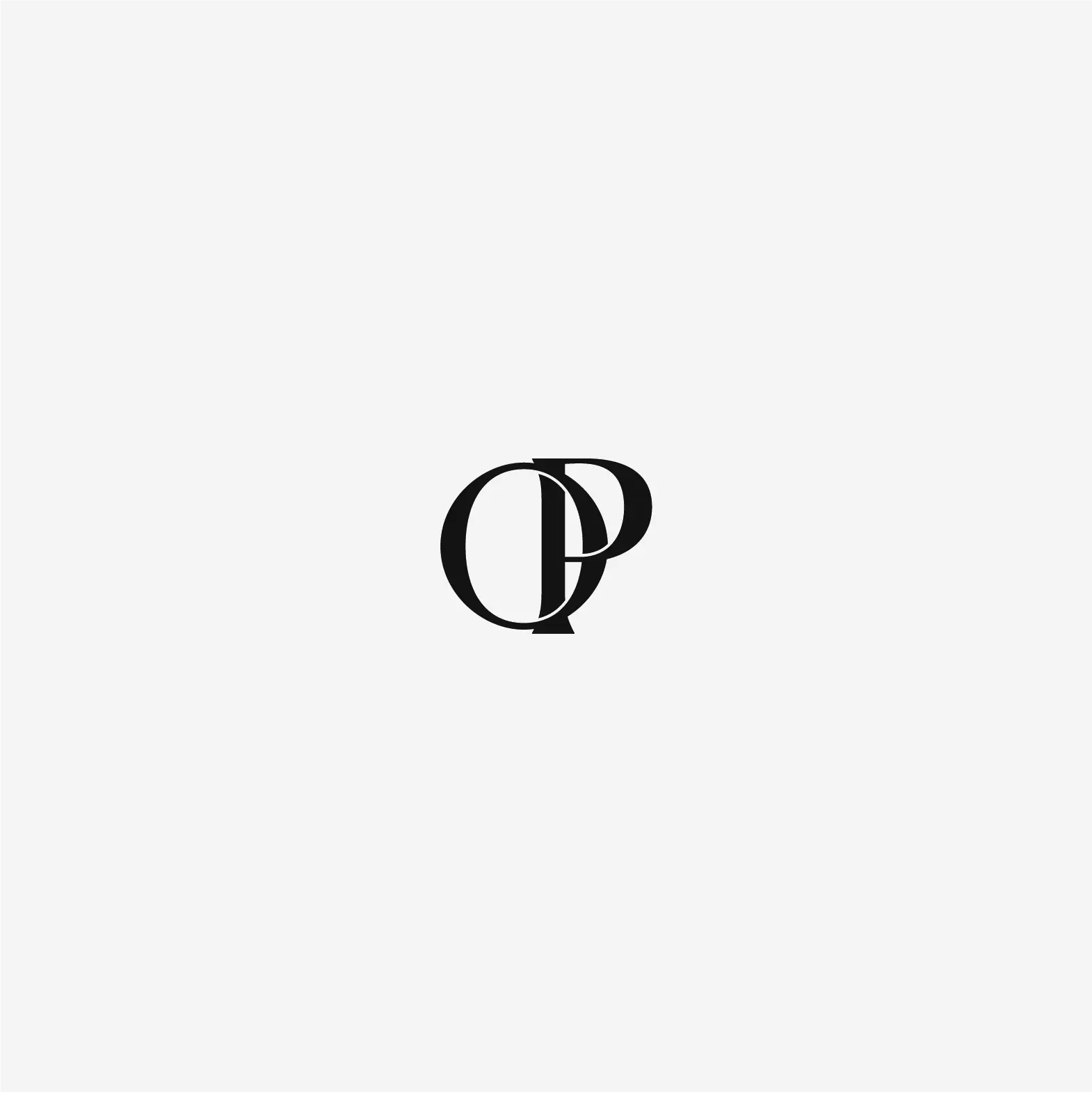
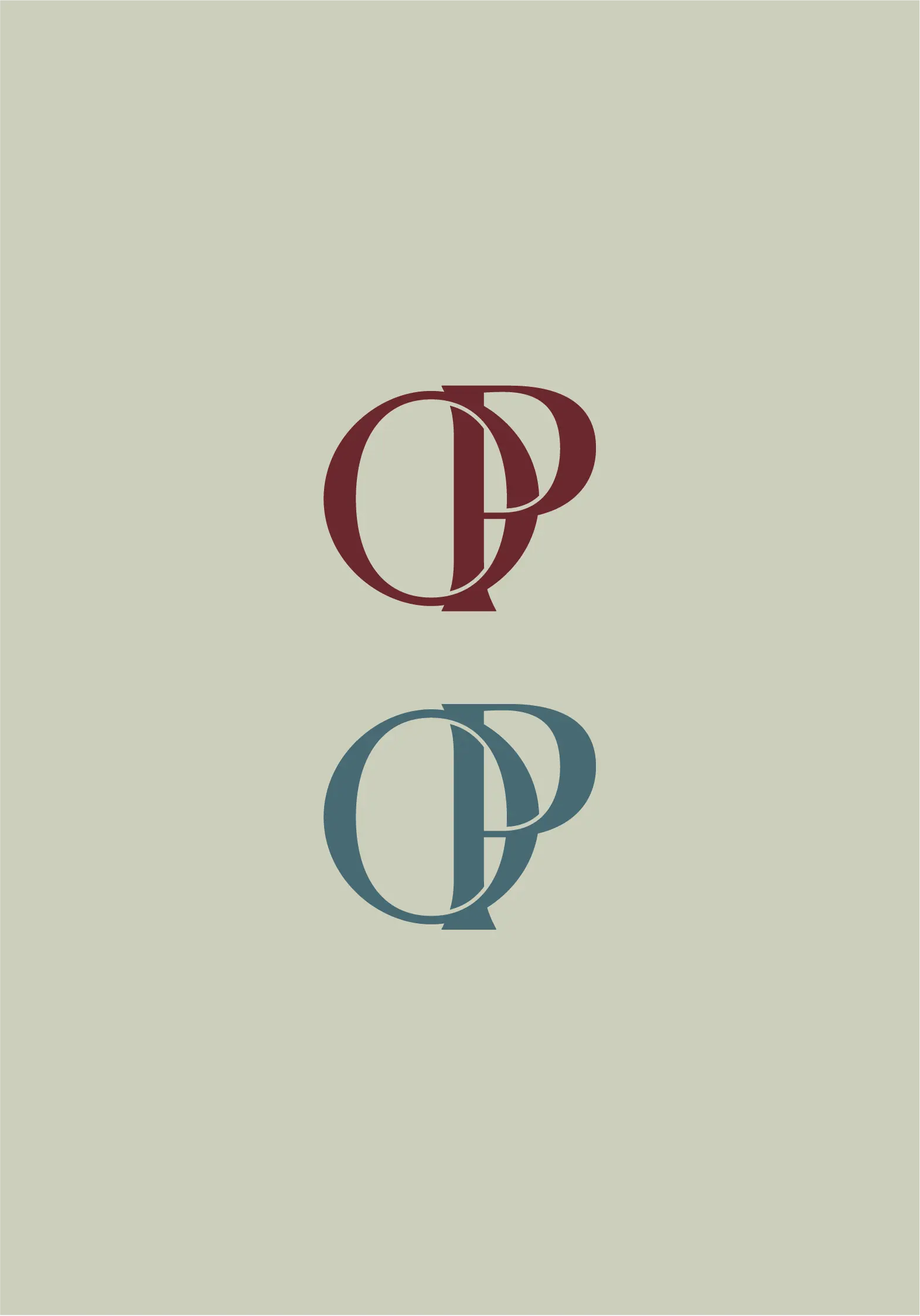
Inspired by craft and form, the new logo blends softness and structure. The OP monogram is iconic yet subtle. Mineral tones, sculptural type, and tactile balance create a timeless aesthetic, refined, editorial, and rooted in meaning.
Inspired by craft and form, the new logo blends softness and structure. The OP monogram is iconic yet subtle. Mineral tones, sculptural type, and tactile balance create a timeless aesthetic, refined, editorial, and rooted in meaning.
Inspired by craft and form, the new logo blends softness and structure. The OP monogram is iconic yet subtle. Mineral tones, sculptural type, and tactile balance create a timeless aesthetic, refined, editorial, and rooted in meaning.
A Feeling for Colour
A Feeling for Colour
A Feeling for Colour
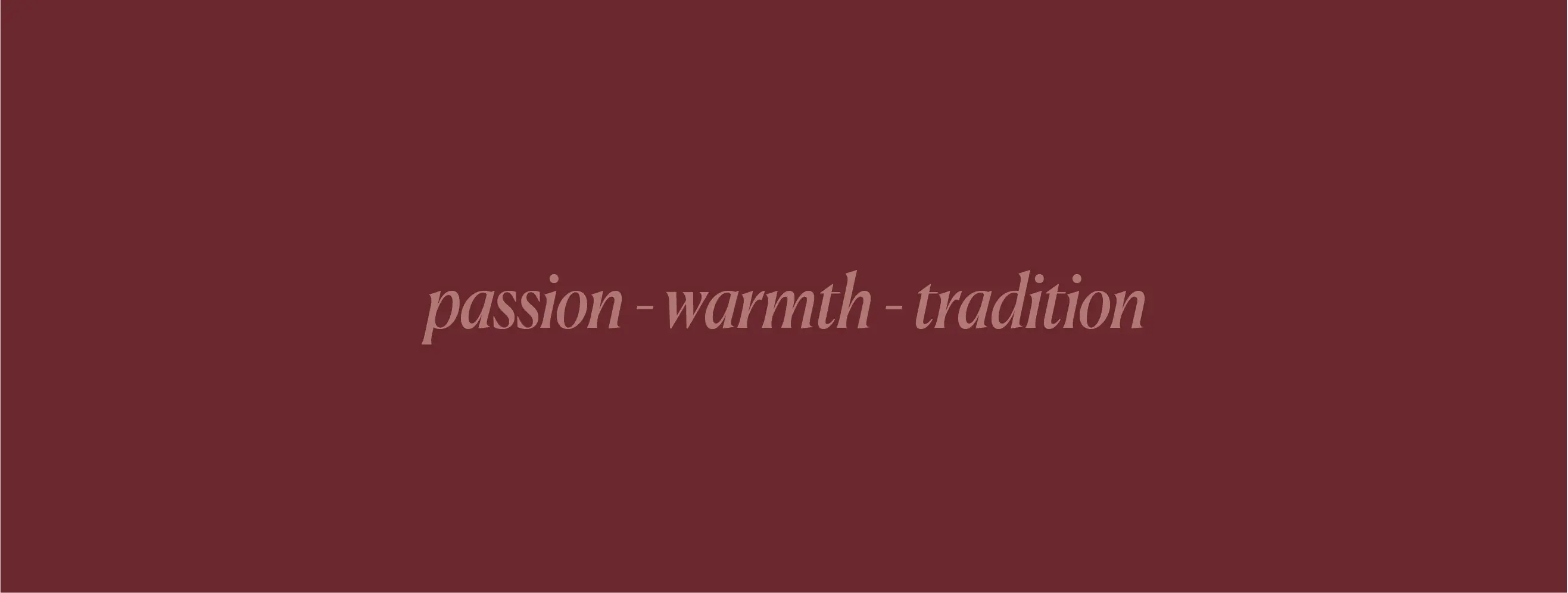
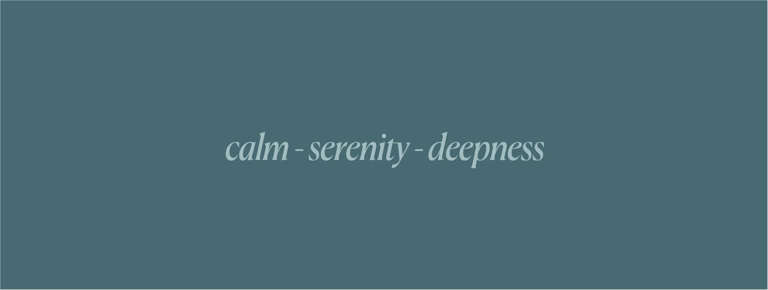
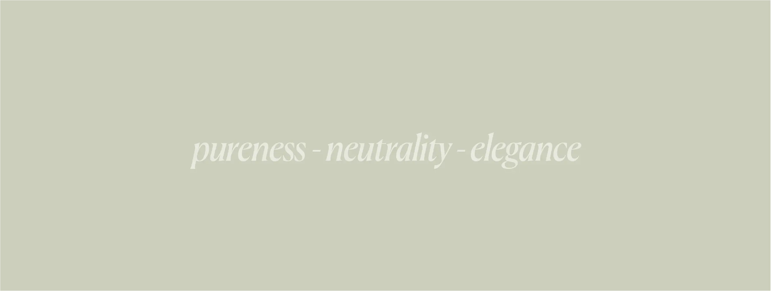
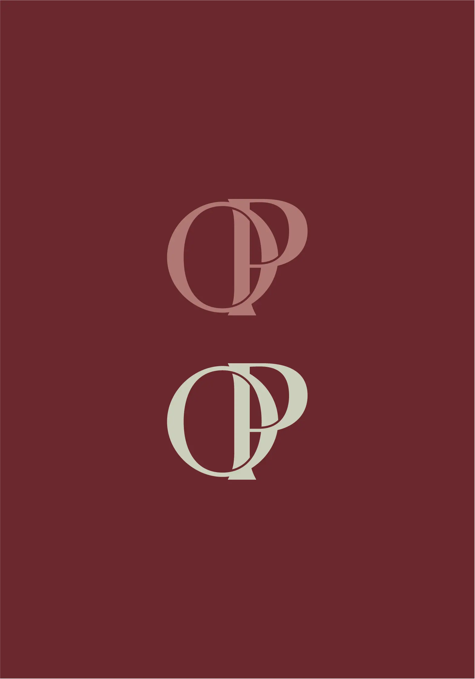
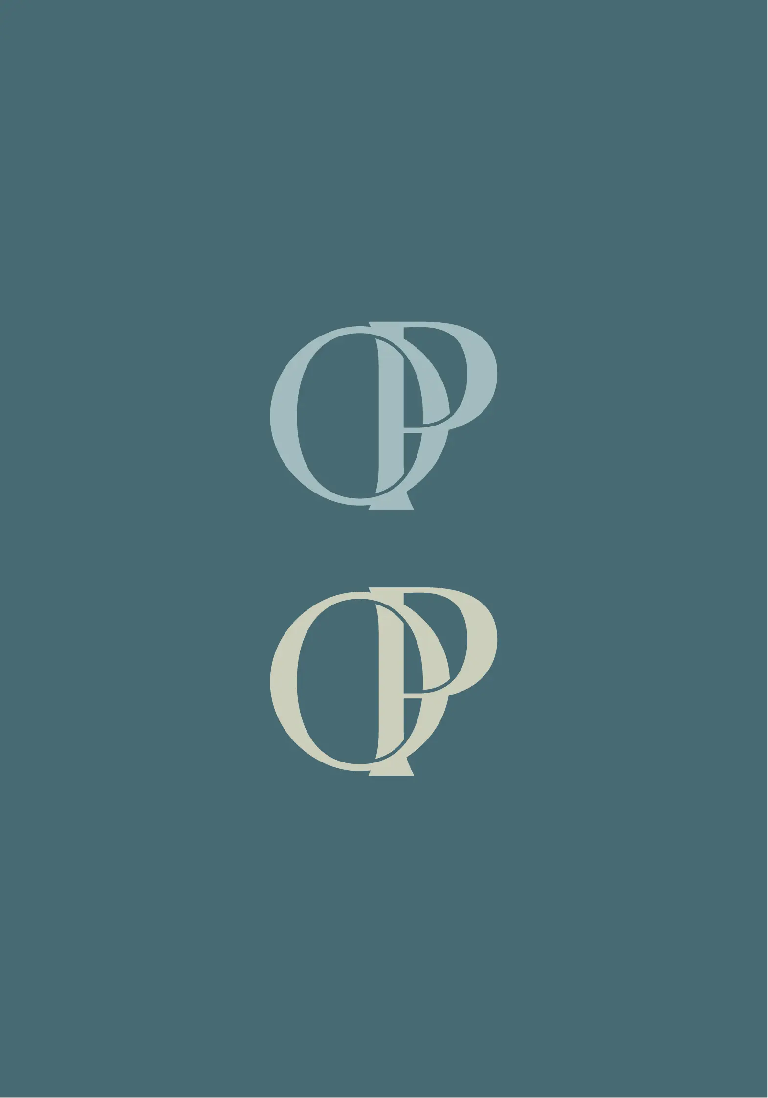
Three colors, three stories that come together to tell the story of a brand. From its deep roots in Mexico, the place where each piece is crafted by hand, to the vivid colors of unique minerals that represent Olga Prieto’s vision.
Syrha reflects the brand’s passion, warmth, and strong tradition in Mexico. Hydro, a blueish tone, connects the brand with minerals like lapis lazuli and aquamarine, it evokes calm, serenity, and depth. Bridging the two is Celadon Tint, a soft hue that brings purity, neutrality, and elegance.
Re-Brand Usage
Re-Brand Usage
Re-Brand Usage
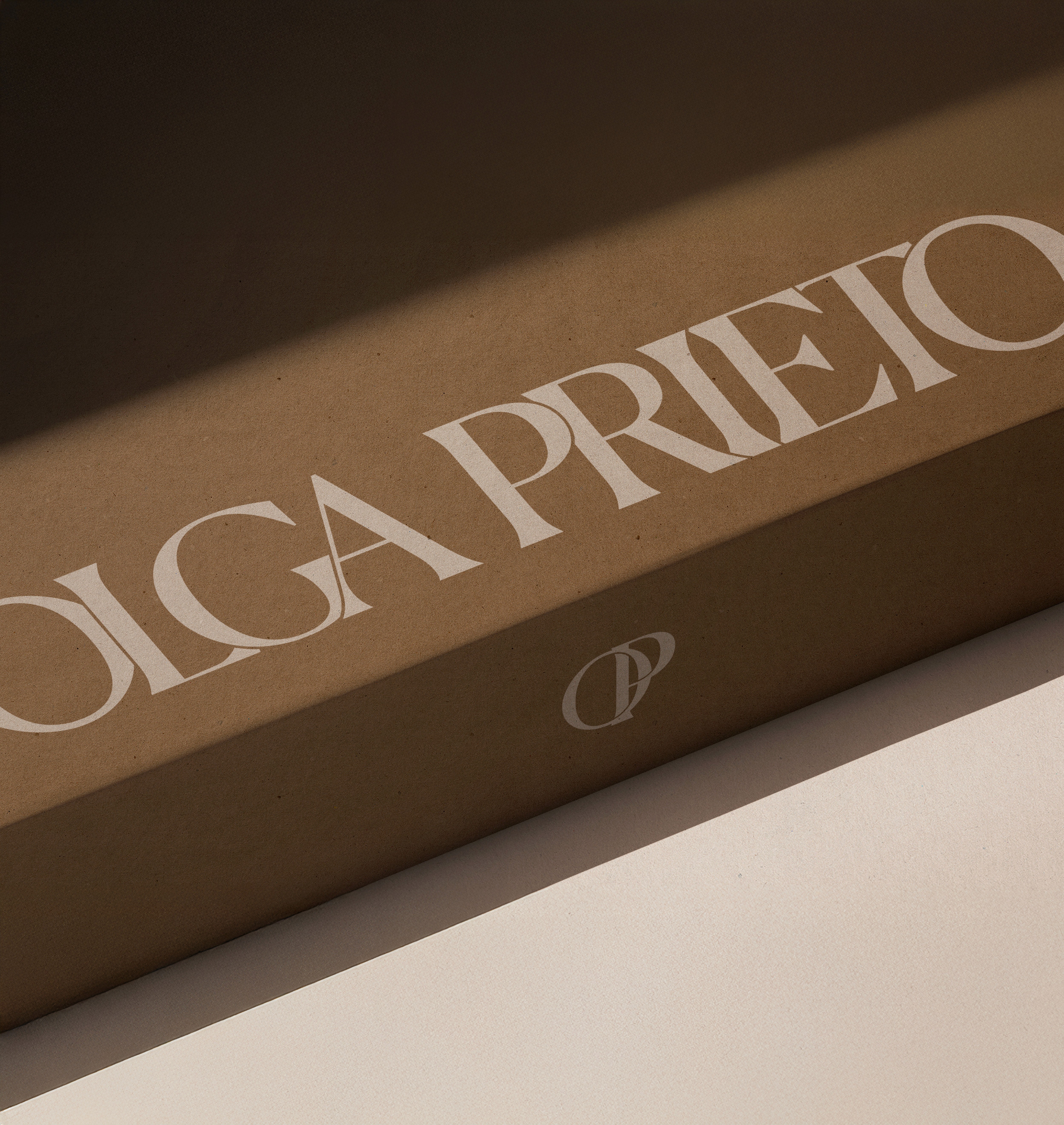
The full wordmark is used to create graphic presence, its strength and elegance give the brand a distinct visual identity. On the other hand, OP is used as a highlight; it’s the stamp that adds detail and connects to the brand’s story. It’s more than just a logotype, it reflects how each piece is crafted in its own unique way.
The full wordmark is used to create graphic presence, its strength and elegance give the brand a distinct visual identity. On the other hand, OP is used as a highlight; it’s the stamp that adds detail and connects to the brand’s story. It’s more than just a logotype, it reflects how each piece is crafted in its own unique way.


Wordmark & Logotype
Wordmark & Logotype
Wordmark & Logotype
From a fully elegant and timeless wordmark to a logotype that keeps that same spirit while adding a clear connection to jewelry, with pieces elegantly joined by hand, always creating one-of-a-kind designs.
From a fully elegant and timeless wordmark to a logotype that keeps that same spirit while adding a clear connection to jewelry, with pieces elegantly joined by hand, always creating one-of-a-kind designs.
From a fully elegant and timeless wordmark to a logotype that keeps that same spirit while adding a clear connection to jewelry, with pieces elegantly joined by hand, always creating one-of-a-kind designs.
Color Codes
Color Codes
Color Codes
Syrha, Hydro, and Celadon Tint create a unique combination of elegance, simplicity, and harmony. Colors that blend seamlessly with the brand’s new direction and visual identity. Strength and passion in contrast with softness and effortlessness.
Syrha, Hydro, and Celadon Tint create a unique combination of elegance, simplicity, and harmony. Colors that blend seamlessly with the brand’s new direction and visual identity. Strength and passion in contrast with softness and effortlessness.
Syrha, Hydro, and Celadon Tint create a unique combination of elegance, simplicity, and harmony. Colors that blend seamlessly with the brand’s new direction and visual identity. Strength and passion in contrast with softness and effortlessness.
Be the exception, NOT the rule.
Be the exception, NOT the rule.
Be the exception, NOT the rule.
NOT a logo, a brand,
NOT a brand, a story,
NOT a story, YOUR STORY.
NOT a logo, a brand,
NOT a brand, a story,
NOT a story, YOUR STORY.
NOT a logo, a brand,
NOT a brand, a story,
NOT a story, YOUR STORY.
Back to top
Back to top
Back to top
Explore our projects
Explore our projects
Explore our projects
Talk now, not later
Talk now, not later
Talk now, not later